

This week is the annual NIMS conference, a small conference here in Tsukuba in which there are only invited speakers. There is, however, a poster session in which attendees can present their work, so I decided to apply and present a poster. Since last year’s poster was quite poorly attended (but still evoked insightful questions from people in the field), this year’s had to be a bit more appealing. The result is shown in the picture on the right (click to see a large version). As usual, some thought (for better or worse) went into the design:
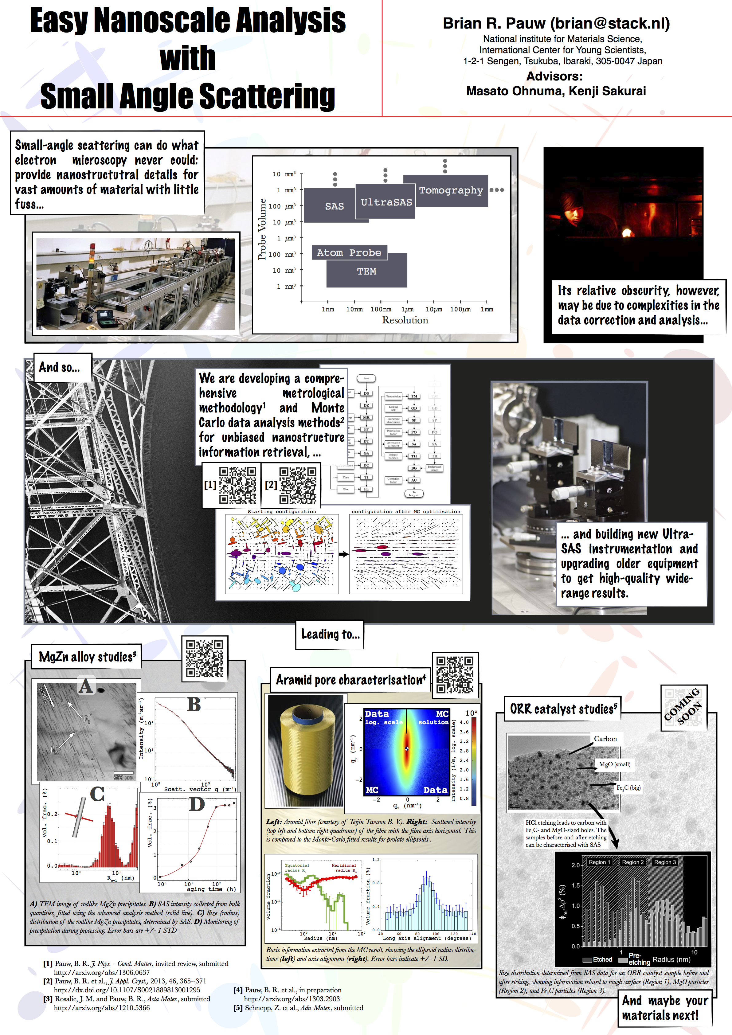
For the design of this poster, “going nuts” was my motto. So I decided to go for a comic-type layout and font, with many images to liven things up. In stark contrast to my previous poster, this one barely contains text, requiring me to present the details alongside(which may now be problematic, as I have managed to catch a cold at just the right time).
The comic format is chosen to be a European-order comic (read left to right), which may be a little difficult for the Japanese who are used to read comics right-to-left. To aid the flow of the text, I used vertical placement of the text blocks to highlight the order of reading.
At the last moment, I realised that I could add references by QR codes. QR codes are here used to refer to websites containing publications or manuscripts with the details of the topics introduced on the poster. I decided against including a vcard QR code on the poster, containing all my contact information, as it looks too much like a photo-gone-wrong.
The choice of font was Marker Felt for all text blocks highlighting the main story of the poster (deciding against comic sans here, in the hope that Marker Felt is a bit more widely accepted in the typographical community). The font for image captions and references is Baskerville, which is a classy, if a bit out-dated font. Where legibility was paramount, Courier was used, which is a fixed-width serif font, designed for legibility on computer terminals. I am not so happy with the title font (Impact), as it is a bit narrow, but a suitable replacement could not be found in time.
Lastly, there is supplementary material with the poster, which includes a sheet with my v-card and real business cards in a small paper pocket. There are also four out of five references in paper-form printed, hanging underneath the poster with one or two extra copies for the very interested.
The poster session is tomorrow, after which I hope to update this post with the estimated effect! Update: the poster did not garner much interest among the conference attendees, which was a bit disheartening. I will hang the poster outside my office, in the hope it may still attract some readers by itself…
Well, thanks for the idea of using QR codes, I never thought about that! I’ve included one leading to the webpage of our group’s project in my next poster. I sized it to 3×3 cm which is more than enough for a paper print. I’ll be printing on cloth though (much easier for travel) so I hope it will withstand the possible distortion from the support.. we’ll see!
Hi Sam,
Depending on the audience, they might or might not use them. I think it is possible on cloth, if there is no fold directly over the code! Anyway, good luck with the poster presentation and let us know what your findings are!
B.
The QR code printed on cloth could still be nicely read out if it weren’t for the very bad arrangement of the poster panels: (i) 90 degree zigzag (/\/\) which do not let any of the two adjacent presenters do their job properly and (ii) a very narrow spacing between the panels lines.