
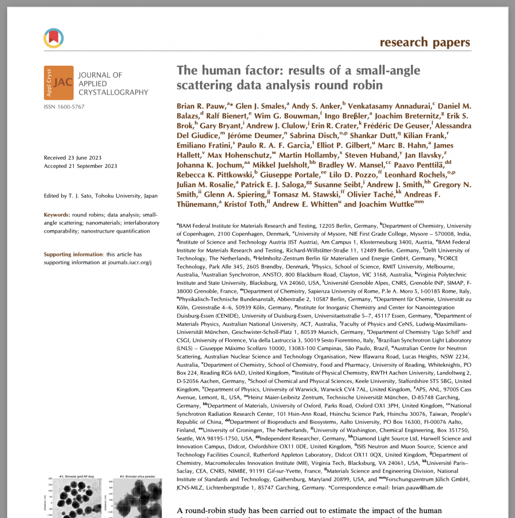
Almost two years since the first public call for participation, the results of the data analysis round robin for small-angle scattering have now been published (available open access at Journal of Applied Crystallography here)! The author list alone is a sight to behold, and I’m very happy that I could include the list of contributors in this paper.
This work highlights that the personality of the researcher can affect the results obtained during the small-angle data analysis step. Moreover, it indicates that intercomparability between results from different laboratories might not be so straightforward. Lastly, it appears we do not necessarily get better with age or experience.
While most of the details can be read in the paper (and do particularly note my favourite sentence at the very end of Paragraph 4.2), there are some things I would like to highlight, some of which did not end up in the manuscript…
The figures in the paper were but a few of many figures generated in the Jupyter notebook. Given the amount and diversity of results, several different plotting styles needed to be attempted to find the clearest visualisation for a given relationship. To those interested in these alternative visualisations, or who would like to play with visualisations of these data themselves, they are highly encouraged to check out the notebook. If someone has a better visualisation for Figure 8 in particular, I’d be very interested!
So far, we have done two Round Robin experiments, and as before, we did get a lot more promises than delivered results. This is not unexpected, but is important to keep in mind for those designing or running other Round Robin experiments: it is an interesting and exciting idea to participate in an experiment, but in the end we’re all constrained in the time we have to spare. In this case, the significant chunks of time needed for the more challenging datasets (#3 and #4) might have discouraged several potential participants from submitting their results. To get better information on such more challenging datasets, the format of these challenges might need to be changed. Also, I wasn’t so careful in my wording in the answer sheet and might’ve accidentally talked about SAXS when I wanted to say SAS! Sorry neutron wranglers, I did not mean to exclude you!
To me, it was particularly interesting that software UI design really matters for user understanding. Half of the users of SASfit or SasView did not know if this software gives volume-weighted or number-weighted size distribution means and widths, with both showing a near 50/50 split between users’ understanding on what the software reports. For other software, users were much more certain. A clear indication of UI design importance.
I was hoping to be gleaning more information from the variation between reported distribution widths, but, unfortunately there was little consistency between the reported values. Participants reported distribution widths in whatever values the software provided, and did not generally convert these to a standard deviation as I had requested. This was not totally unexpected to me as this conversion is not always straightforward if the software does not report it itself. That’s why I’m asking for the software (programmers) to add reporting of the distribution moments for each distribution, so we can compare our values…

Lastly, how dumb are we as a community to confuse and tire users with our historical baggage? Over the years, we’ve come up with different ways to represent scattering angle, different units for angle and intensity, sphere size (cylinders is where it really gets confusing), and so on. In my dreams we are sitting down as a community and just voting on what to use. Perhaps it would make for a fun lunch session at SAS2024? Who’s with me?